The Cartographer’s Palette: Analyzing Ink and Pigment Composition
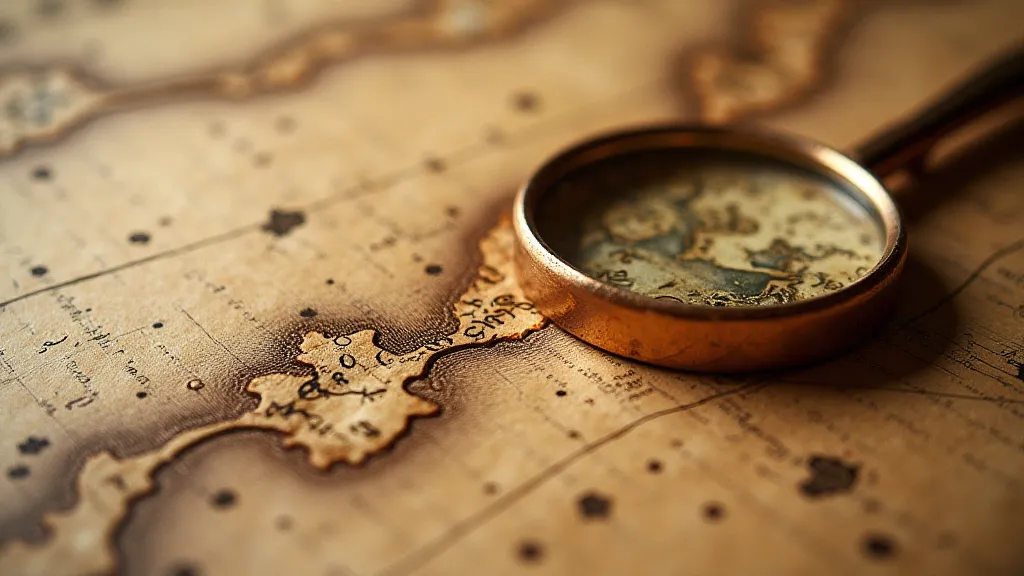
There's a quiet reverence that settles over you when you hold an antique map. It's more than just paper and ink; it’s a whisper of history, a tangible link to a world seen through the eyes of another, a cartographer meticulously charting the known (and the imagined). Years ago, when I first started my apprenticeship with a seasoned map conservator, I was overwhelmed by the sheer age and fragility of these artifacts. He's imparted much wisdom over the years; none more so than the understanding that appreciating a map’s story begins with understanding its materials - its ‘palette’, if you will. This isn't just about identifying colors; it's about decoding the cartographer’s intentions, their available resources, and often, a glimpse into their geographical context.
The Alchemy of Ink: Beyond Black and Brown
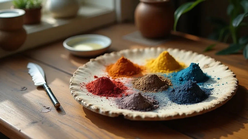
When we think of antique maps, the colors black and brown readily come to mind. These were, undeniably, staples. Iron gall ink, derived from oak galls (growths on oak trees), was a workhorse for centuries. It's remarkable, really – a natural reaction between tannins, iron salts, and an astringent solution, yielding a permanent, deep black. But there’s more to it than meets the eye. Examining the ink under magnification, you're likely to see subtle variations in tone. This isn't always due to inconsistency in preparation (though that certainly played a role); it can be a conscious artistic choice. A slight reddish hue might indicate a higher iron content, while a bluish cast could result from impurities in the water used during preparation. Sometimes, a layer of glazing – a thin wash of a different ink – has been applied to add depth or to correct a mistake. Learning to recognize these nuances is a detective's skill, a subtle language spoken by the cartographer.
Brown inks, often mistaken for a single entity, are equally complex. They are frequently mixtures—a base of iron gall ink blended with earth pigments like umber, sienna, or ochre. The proportion of each ingredient dramatically affects the final color. These earth pigments, readily available throughout Europe and Asia, offered an accessible and relatively inexpensive alternative to more exotic dyes. Think about the limitations—a cartographer working in a remote region might have relied on locally sourced pigments, resulting in a map with a distinctly regional palette. Tracing the presence of particular pigments can, therefore, offer invaluable clues to the map’s origin and the cartographer's travels.
A Rainbow of Pigments: Revealing Geographical Stories
Beyond black and brown, a surprising range of colors found their way onto antique maps. These weren’t applied with reckless abandon, though. They were carefully chosen, often for symbolic or practical reasons. Blues, typically derived from azurite or later, Prussian blue (a groundbreaking 18th-century invention), were used to depict bodies of water. Greens, often made from verdigris (a copper-based pigment) or malachite, marked fertile lands and forests. Reds, frequently made from vermillion (mercuric sulfide), held symbolic weight – signifying important routes, boundaries, or even mythical realms.
The availability of specific pigments varied dramatically based on location and historical period. Vermillion, for example, was highly prized but relatively expensive, so its use was often restricted to depicting areas of particular significance. The appearance of Prussian blue, a synthetic pigment, marks a clear demarcation in cartographic history, signalling a shift towards more standardized color palettes and improved reproduction techniques. It's fascinating to think that a seemingly insignificant color choice can tell a story – a story of trade routes, technological advancements, and evolving artistic conventions.
Beyond Identification: Understanding Technique
Simply identifying the pigments and inks used isn't enough. The truly insightful aspect of analysis lies in understanding *how* they were applied. Was the ink applied quickly and boldly, or with a delicate, almost hesitant hand? Were multiple layers of color used to create depth and shading? Did the cartographer use glazing techniques to soften edges or blend colors? The answers to these questions speak volumes about the cartographer's skill, their artistic style, and even their working conditions. A rushed map, perhaps produced under pressure from a patron, might exhibit a less refined application compared to a meticulously crafted piece intended for personal use or a royal commission.
For instance, a map showing evidence of "pointillé" – a technique involving tiny dots of color to create a textured effect – suggests a level of artistic sophistication and a willingness to experiment. Similarly, the presence of "grisaille,” the use of grey monochrome pigments to create a three-dimensional effect, demonstrates a keen understanding of light and shadow.
Dating and Provenance: The Silent Witnesses
The composition of inks and pigments often provides crucial clues to a map’s age and provenance. The widespread adoption of Prussian blue, as mentioned, acts as a chronological marker. Similarly, the presence of certain pigments, particularly those only synthesized or readily available during specific periods, can help narrow down the timeframe of creation. Comparative analysis with other contemporary maps can further refine the dating process.
Moreover, the source of raw materials can be incredibly revealing. Vermillion, for example, was historically mined in various locations, each yielding a subtly different hue. Identifying the specific source of the vermillion used on a map can potentially link it to a particular region or workshop. These seemingly minor details, pieced together through careful analysis, contribute to a deeper understanding of a map’s history and its place within the broader context of cartographic development.
The Cartographer's Legacy: A Lasting Connection
Analyzing the ink and pigments in an antique map is more than a technical exercise; it's an act of rediscovering a forgotten narrative. It's about connecting with the cartographer, understanding their artistic choices, and appreciating the challenges and opportunities they faced. It’s about understanding that each stroke of the pen, each dab of pigment, is a testament to human ingenuity, perseverance, and a relentless desire to chart the world—and our place within it. The faint scent of aged paper and the delicate hues of the inks, speak across centuries, inviting us to appreciate the artistry and the enduring legacy of the cartographer’s palette.